Redesigning LG.com navigation based on customer behavior data.
- Role
- Lead Product Designer
- Team
- 3 PMs, Engineering, Data analytics
- Timeline
- About 6 months
The problem
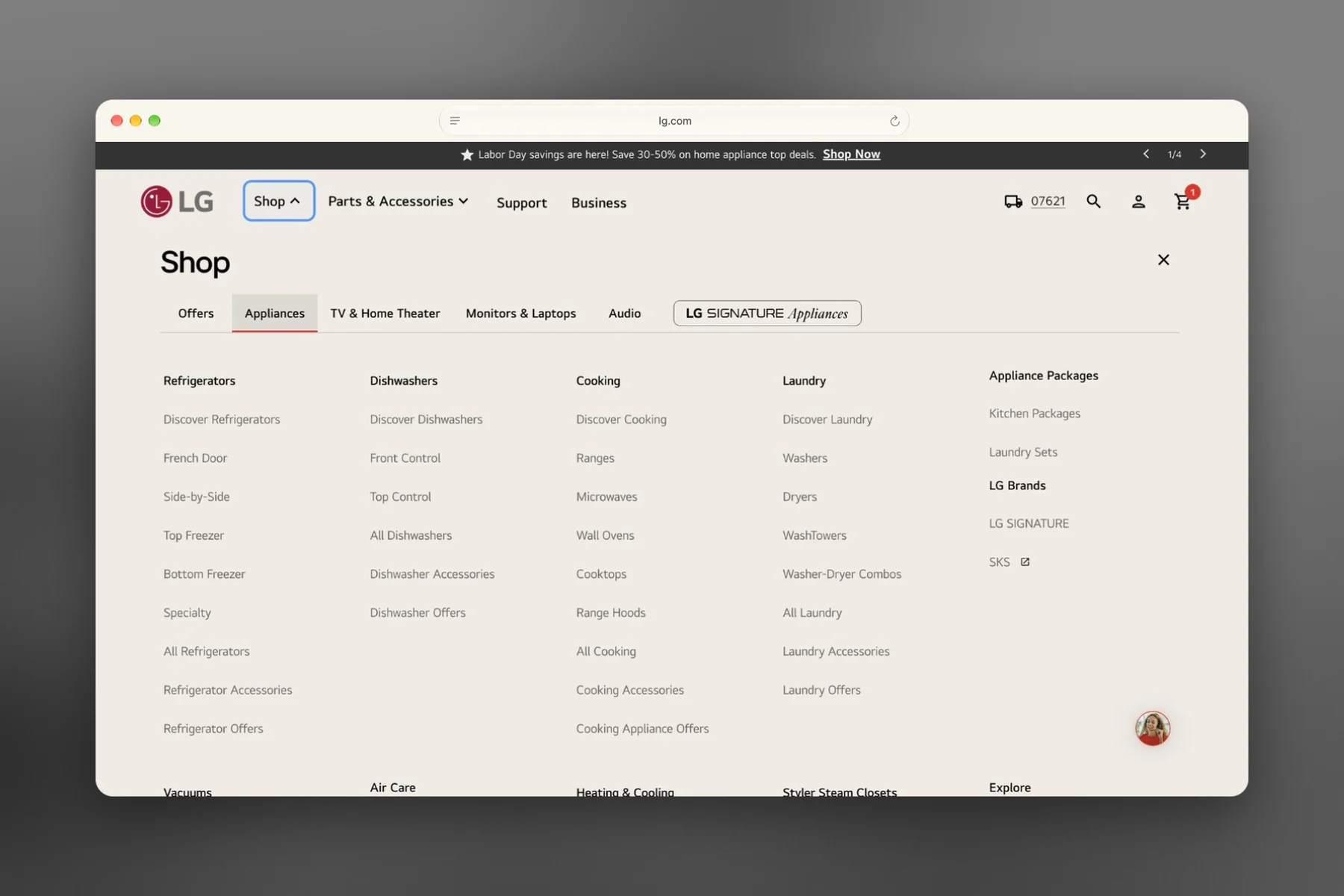
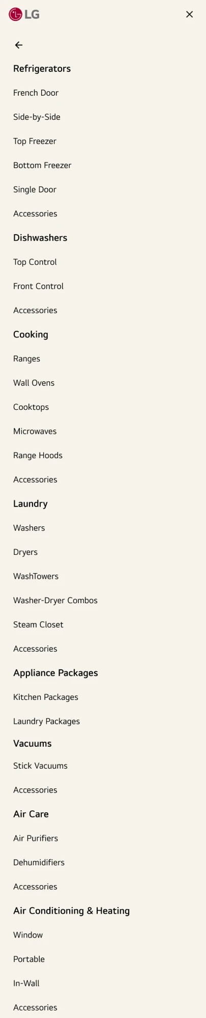
LG.com's navigation had become the hardest part of the site to scan. Four years of one-off additions from different teams, with nobody governing them, left a wall of links that was overwhelming to use, and people were giving up and switching to search.
-
Key path to purchase
45% of appliance purchasers use the navigation
-
Link overload
238 links, up from 80 in 2022, and 74 of them duplicates
-
Below the fold
46% of Appliances links out of view
-
Clicks concentrated
60% of clicks go to 30 links
 After
 Before
The new navigation
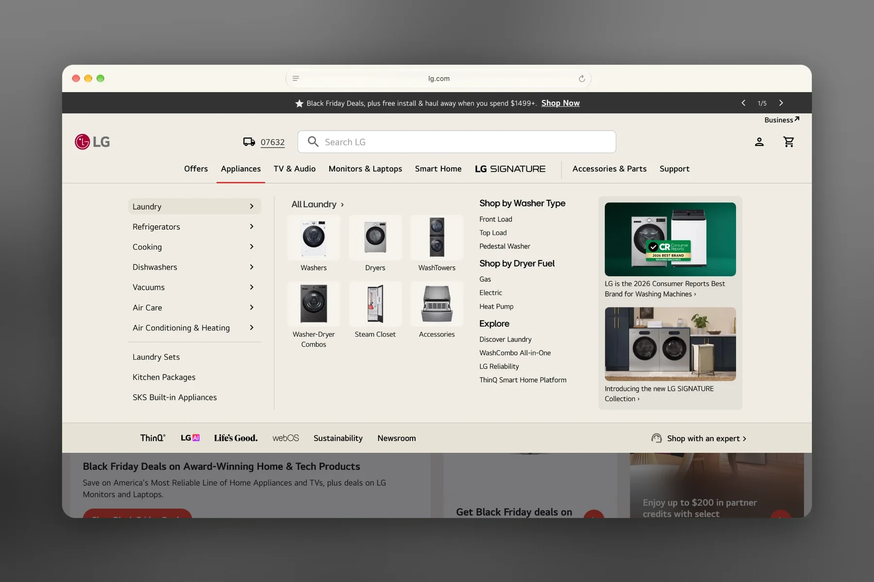
Using behavioral analytics and FullStory insights, we rethought the hierarchy and cut extra levels and redundant links, so the structure matches how people shop.
-
Opens on hover
A simple hover on desktop
-
Grouped by type
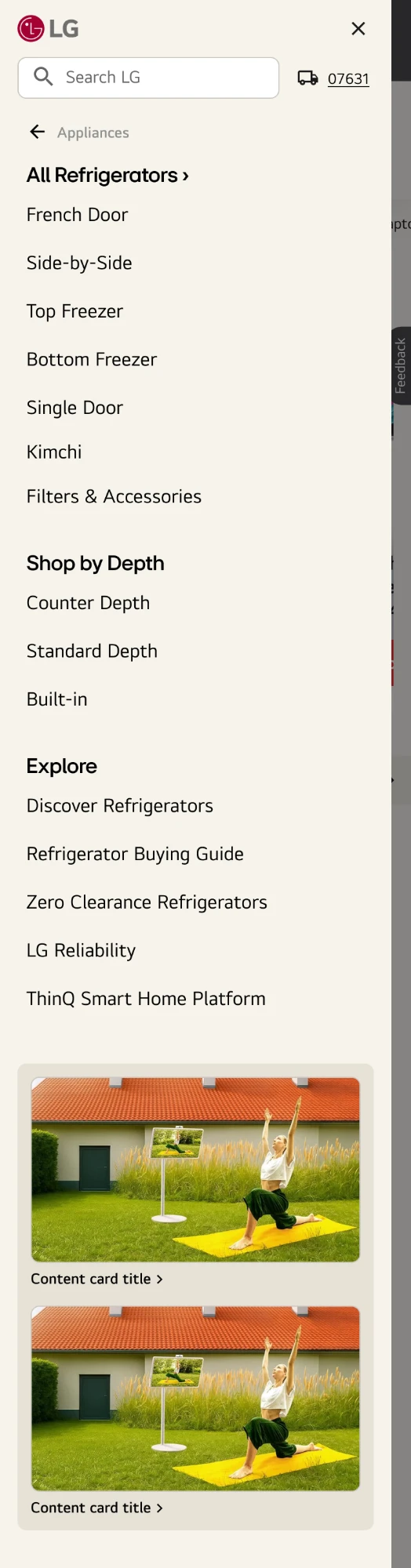
Subcategories grouped by product, with images
-
Data-driven links
Curated links based on filter insights
-
Strategic initiatives
Marketing gets its own cards, apart from categories
Bringing it to mobile
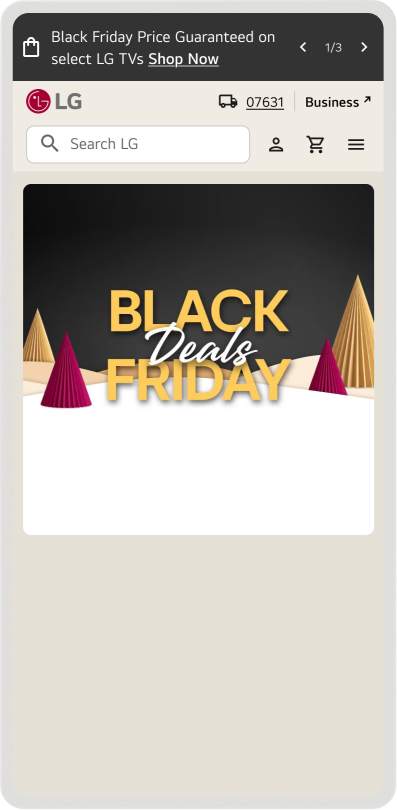
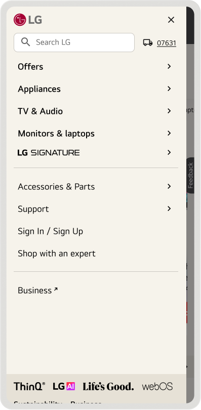
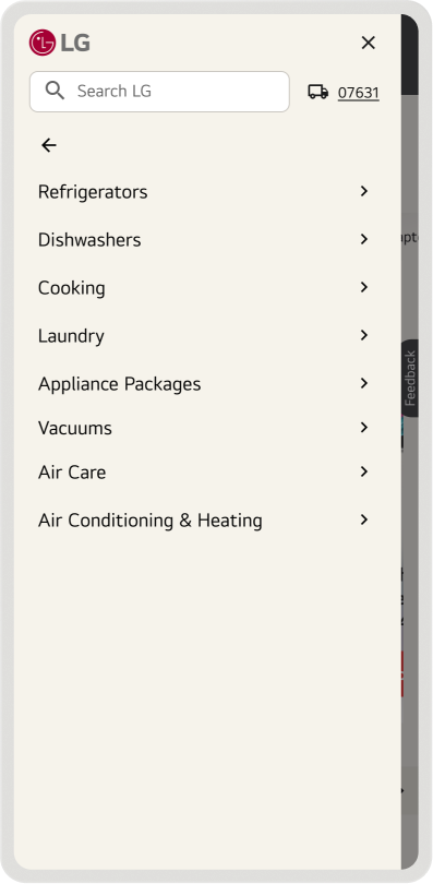
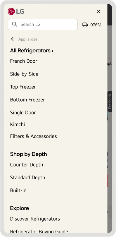
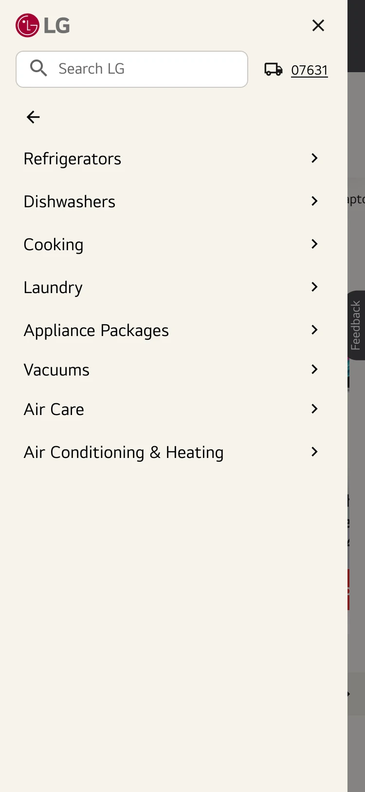
On mobile, we kept the same framework as desktop but turned it into a progressive flow that goes one level at a time, rather than every link stacked on one long page.
-
Progressive navigation
Guides users and reduces page length
-
Exposed search bar
Search entered directly from the navigation
-
Dedicated utility actions
Sign in / Support

Results
Fewer people give up on the menu and fall back to search, and more of their clicks land on a product page. Mobile saw a 20% lift in navigation interaction.
For a walkthrough of the end-to-end process, reach out.
design.mikemendez@gmail.com