Rebuilding LG.com's category and product pages for mobile shoppers.
- Role
- Lead Product Designer
- Team
- PM, Engineering, Stakeholders
- Timeline
- About 6 months

The problem
Over half of LG.com's traffic was mobile, but the category and product pages were built for desktop. Everything shoppers needed to make a decision sat below the fold, and a lot of them didn't make it to the bottom of the page. Our surveys and heat maps showed where the pages were failing, and the engagement data backed it up.
-
Below the fold
Oversized spacing pushed key content out of view
-
Unclear actions
Users weren't sure what was clickable
-
Hard to scan
No hierarchy, and a lot of content to get through
-
Filters out of reach
Hard to access while browsing products
-
Specs buried
Specifications were hard to find
The category page
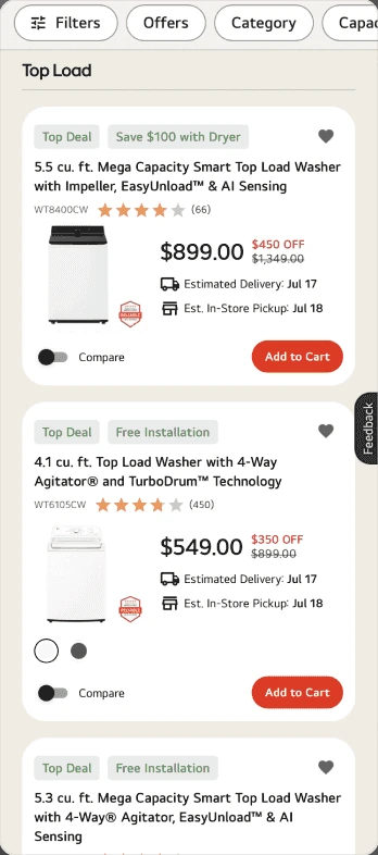
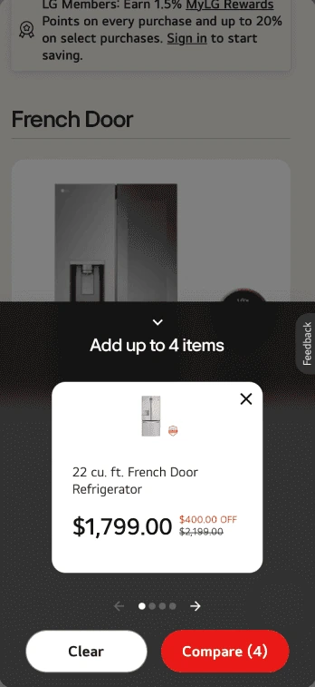
The category page is where shoppers explore the lineup, but on mobile one product fit on screen at a time, and fewer than a third of shoppers (32%) reached the bottom of the grid.
Leaner product cards
I removed extras like member pricing and rebate lines, and reworked the hierarchy so the product name and price stood out. Tightening the layout fit 2.5 product cards on screen, up from one.
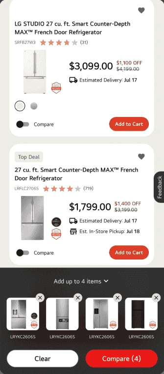
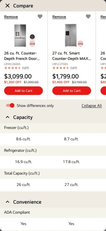
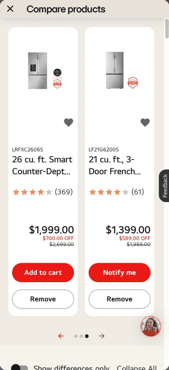
Filters and compare
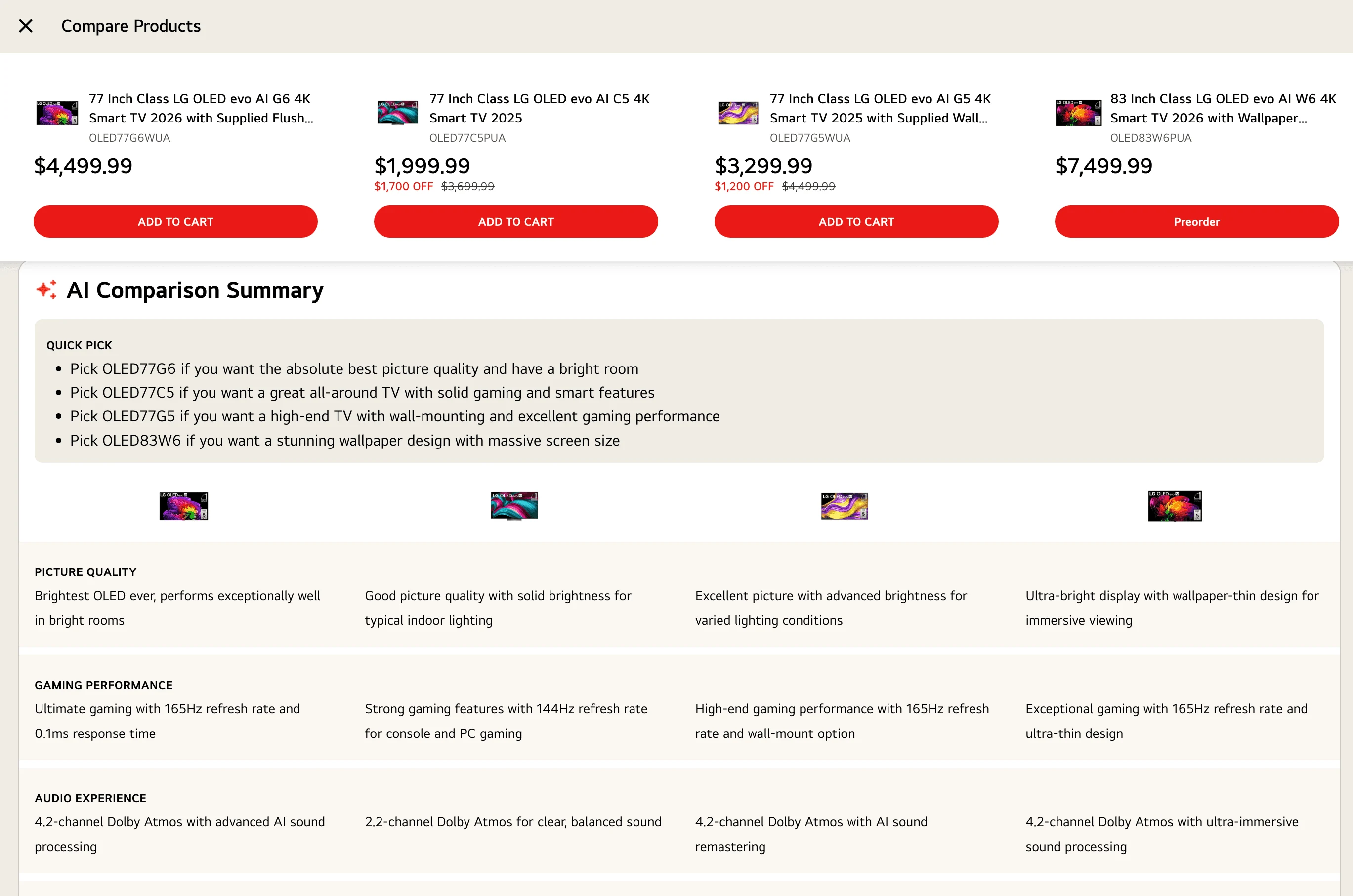
A sticky filter menu lets shoppers refine their search without losing their place. I stripped the compare tray down to the key elements and made it persistent, so it takes up 20% of the screen, down from 50%. On the compare page, side scrolling replaced the carousel, so all four columns are easy to view.
The product page
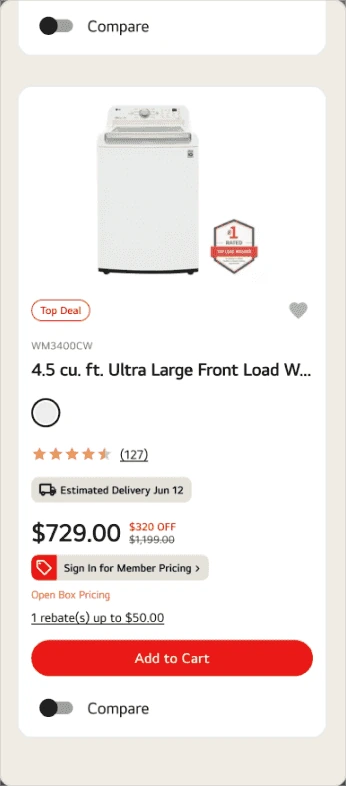
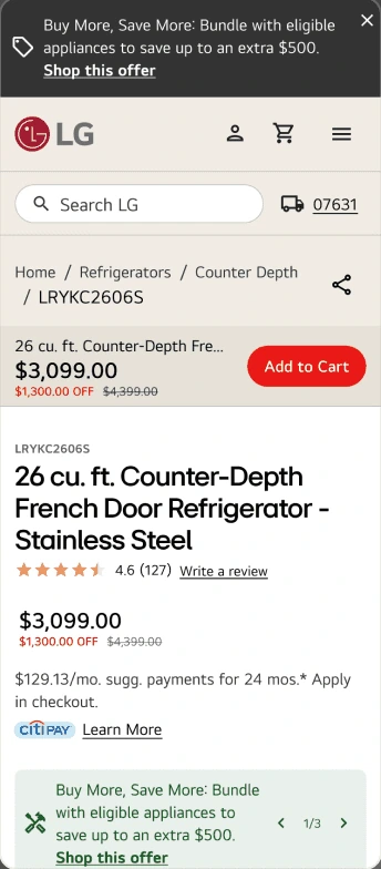
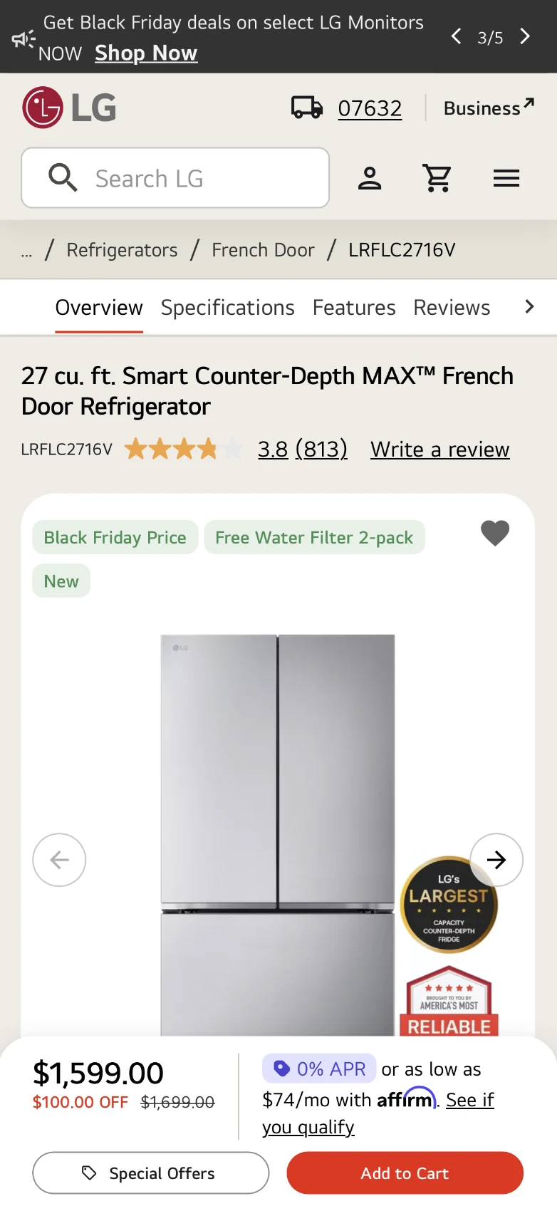
Once shoppers pick a product, they need to confirm it and find the details that help them decide. On mobile, all of that sat below the fold.
I led with the product name rather than the SKU and put a large product image front and center, so shoppers can tell they're in the right place.
Additional services
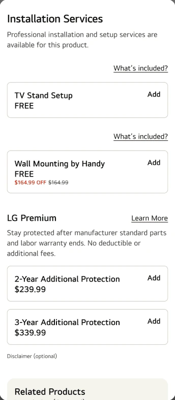
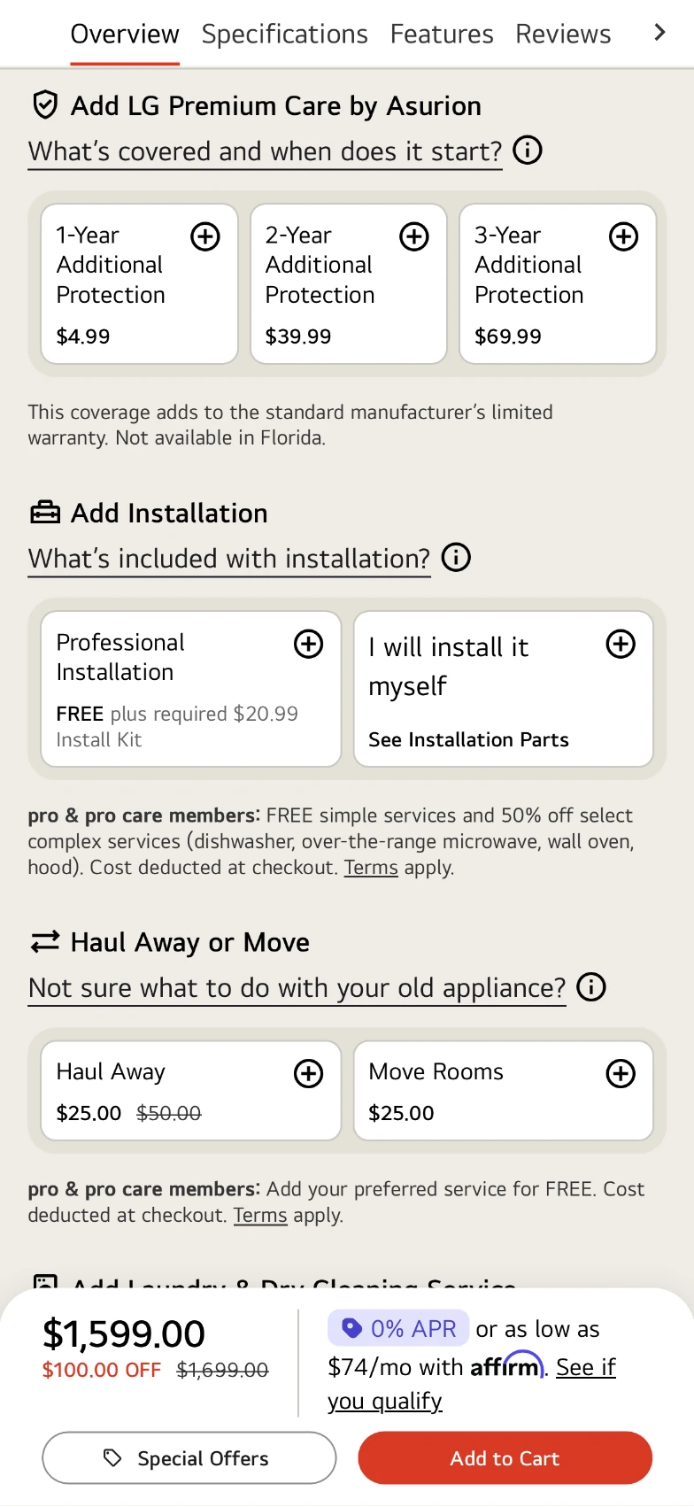
The additional services section over-explained every option. I cut it back to short prompts like "What's included with installation?", a question a lot of shoppers have when weighing extra services.
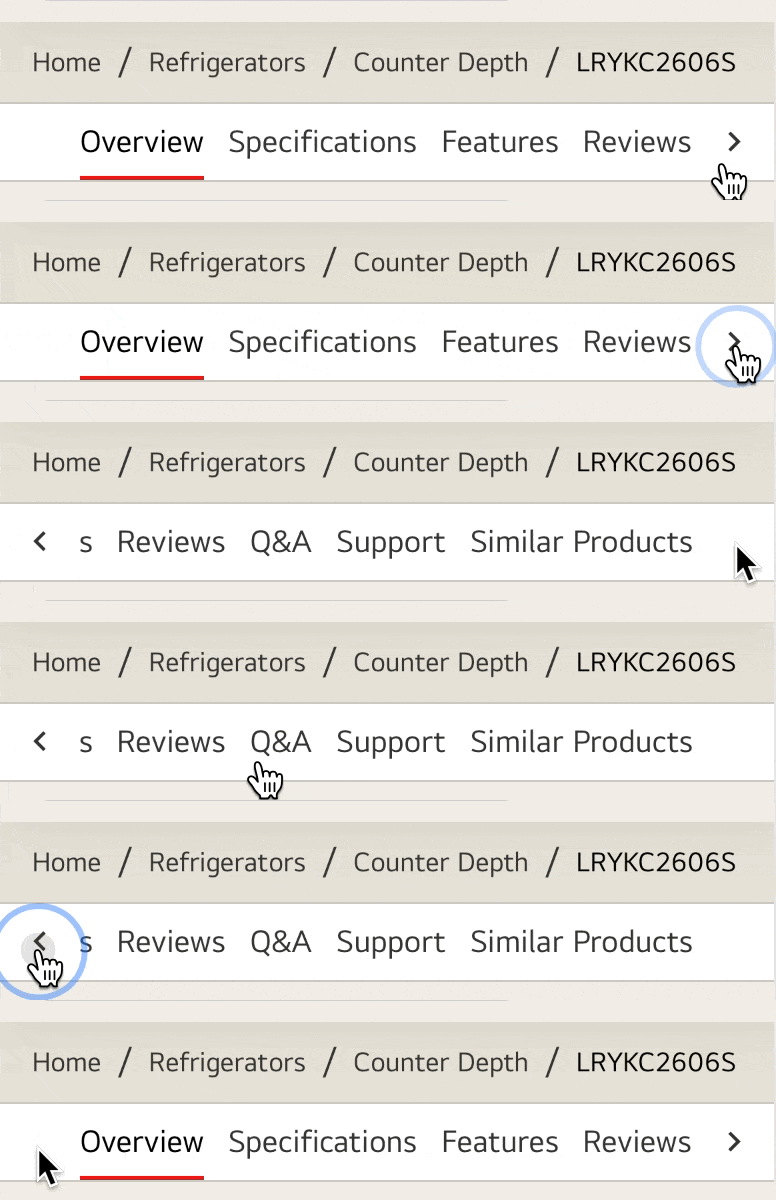
Breadcrumb and sticky nav
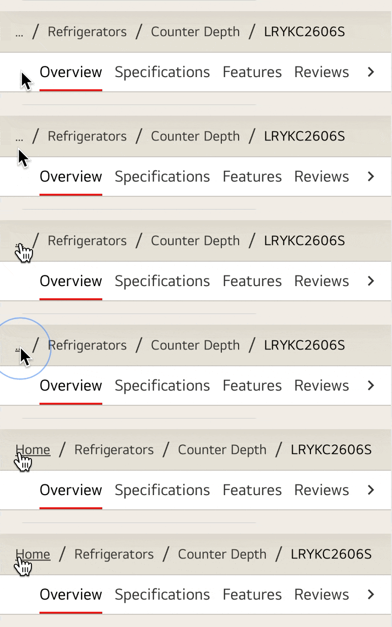
To save space and keep things clean, I shortened the breadcrumb trail and added a sticky nav, so people can jump between sections and find what they need with less effort.
Gallery and specs
Image thumbnails nudge people toward the gallery to explore product features and benefits. Specs carry a lot of weight in the purchase decision, so the sticky nav jumps to them, and a reorganized layout makes them easier to scan without endless scrolling.
For a walkthrough of the end-to-end process, reach out.
design.mikemendez@gmail.com