design.mikemendez@gmail.com
My account
Role: Lead Designer
As the lead UX designer, I was tasked with redesigning the MyLG experience. Since there wasn’t a true post-purchase experience in place, any improvements we made represented a big step forward for both customers and the business.
Our process
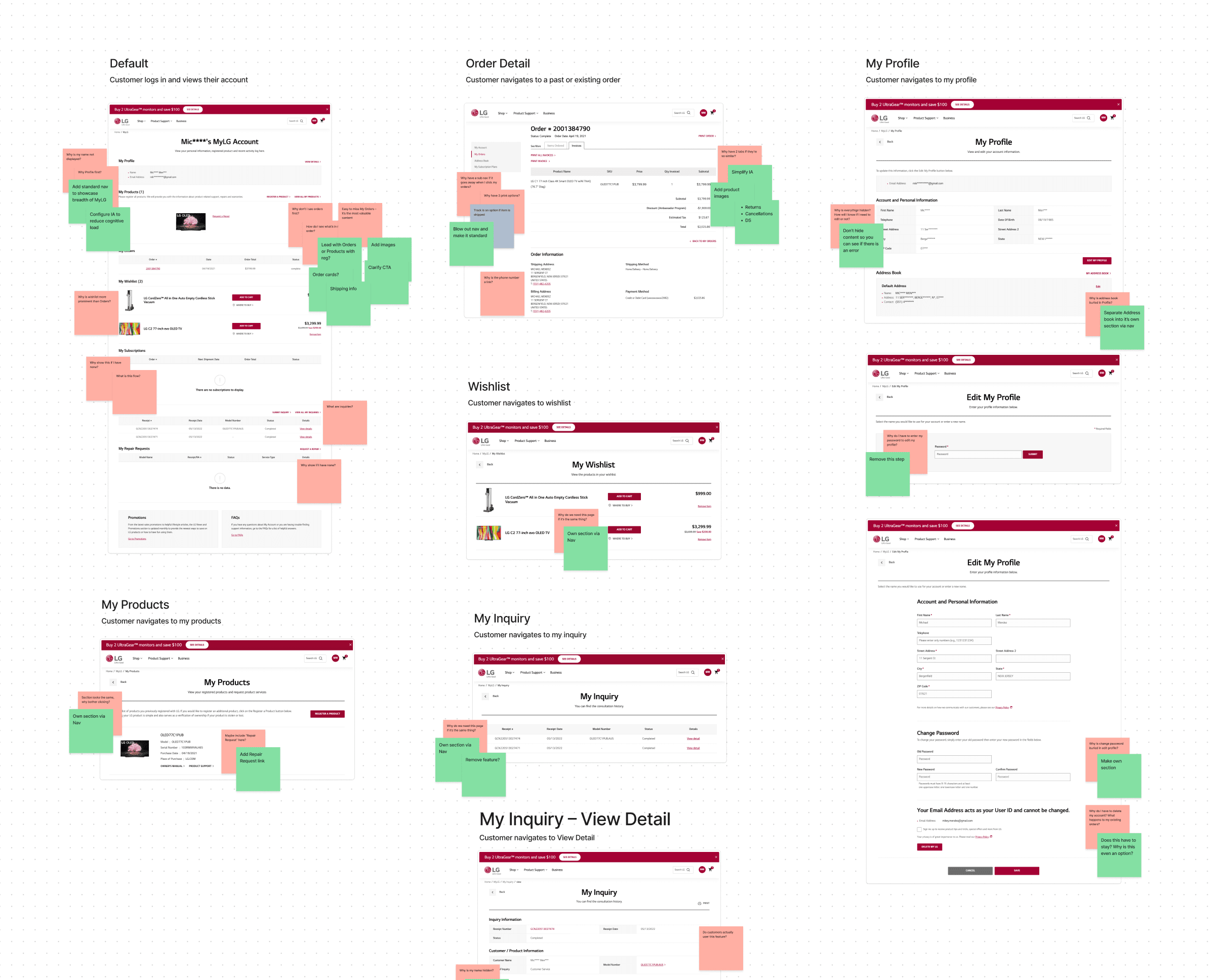
I began by gathering requirements and understanding technical constraints so we could deliver the best possible experience for customers. Using the existing layout as a starting point, I rearranged elements to make information easier to understand and navigate.
Working with the team, we mapped the entire experience, asking questions and suggesting improvements during multiple design sessions. This long, detailed process helped us prioritize what mattered most in the content hierarchy.
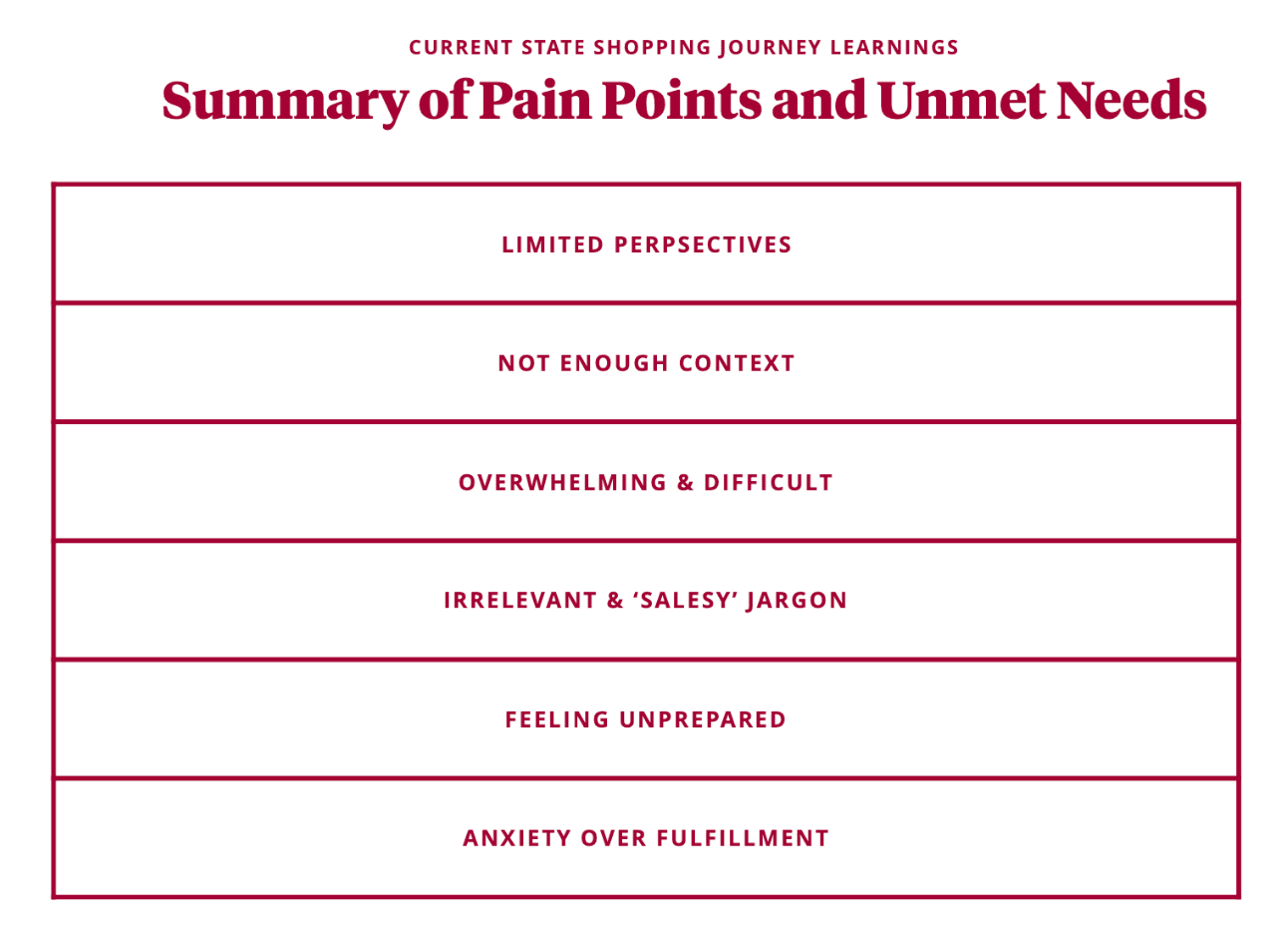
Key insights
The experience used an outdated UI system and needed to be updated to match our current design language
Managing orders after purchase was difficult, damaging trust and brand perception
There was no clear content hierarchy
Simple actions were hard for customers to find and complete
What we did to solve the problem
Challenge: Streamline order management
When customers signed into their MyLG account, the experience was cluttered and overwhelming. Every feature was shown at once, making it harder for people to focus on important actions like registering new products.
Solution:
We simplified the experience by highlighting the benefits of product registration and making the process easy to start. Customers could now clearly see which purchases were already registered and which still needed attention.
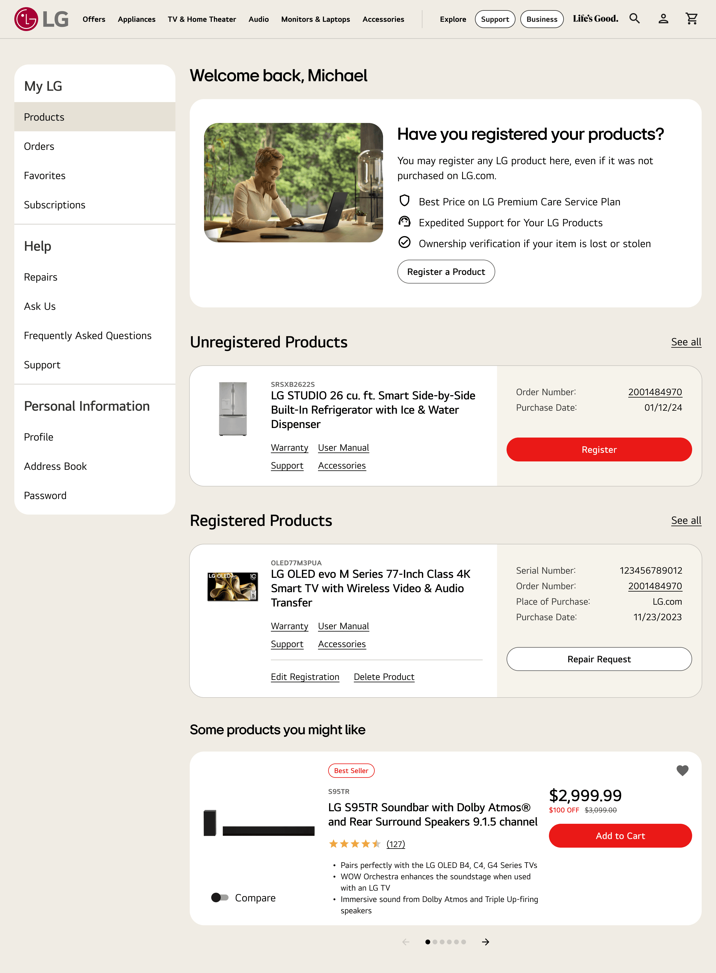
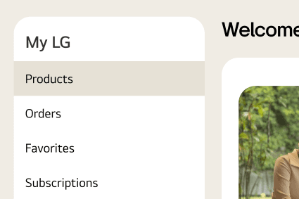
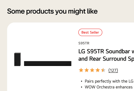
A fixed navigation list organized content into clear sections, helping customers quickly find and complete tasks. We also gave stakeholders the ability to merchandise products with personalized recommendations based on what each customer already owned.
Orders
Customer orders are now shown in a card format with product images, making it easier for people to quickly recognize each purchase. Real-time shipping updates appear right on the card, so there’s no need to open the Order Details every time. If someone needs to cancel or return an order, a single “Manage Order” button clearly shows where to go.
By streamlining the page, we reduced the time customers spent managing orders by 35%. We also tagged each order with its return date, helping remove uncertainty about refunds.
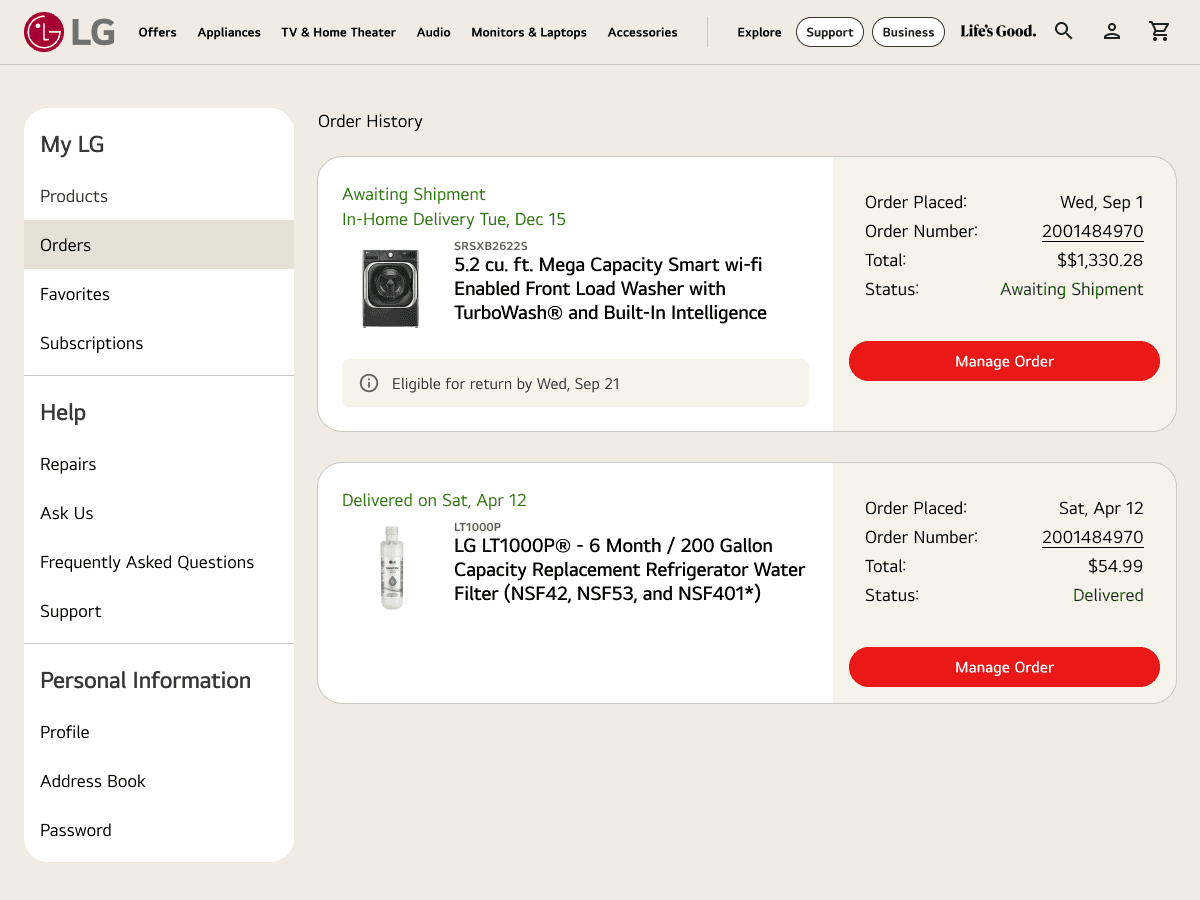
Challenge: Order Details
Order information was buried, forcing customers to click into each order to see basic details. This slowed them down and made it harder to manage purchases efficiently.
Solution:
We switched to a card format with product images, making it easy to recognize each purchase at a glance. Real-time shipping updates now appear directly on the card, removing the need to open the Order Details page. A single “Manage Order” button clearly points to cancellations and returns, while each order is tagged with its return date to remove uncertainty about refunds.
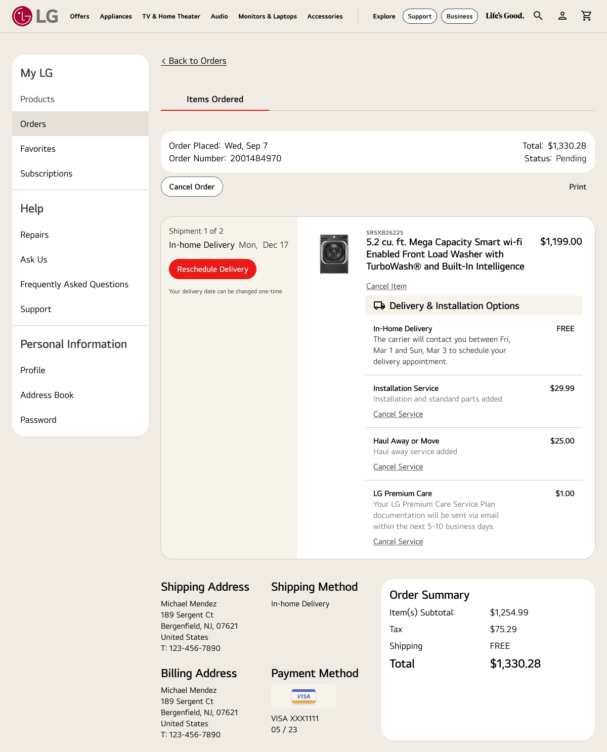
These changes streamlined the page and reduced the time customers spent managing orders by 35%.
This was just the first step in improving the MyLG experience, but it marked a major win for both customers and the business — and it’s laying the groundwork for even bigger updates ahead.
What I learned
Designing for the post-purchase experience can be tricky without clear metrics to guide decisions. That’s why customer feedback becomes even more valuable. Surveys and conversations with customer support teams surfaced the biggest pain points, helping us focus on changes that would make the most impact.
More work